
 ElsyFeb 15, 2016
Feb 15, 2016 at 09:03 AM
#1
So, Asran was asking for some color coordinating help in outfits. I decided to make this super quick crash course in Color Theory that can help you not just assemble good palettes for outfits, but for anything that may need color cohesion.
The Basics
The three parts to describing colors are hue, saturation, and value.
Hue - the actual color (i.e. red, blue, green, etc.)
Saturation - how vibrant the colors are (dull/pastel or bright), or, how much grey is in a color
Value - how light/dark the colors are, or, how much white is in a color
Cool & Warm Colors
A lot of people know that there are cool and warm colors. Things like blue and purple tend to be in the cool category, while red and orange are in the warm category. However, not everyone realizes that there are cool and warm versions of each color. There can be cooler oranges, and warmer purples, even cool and warm blacks. Consider these cools and warms to be a form of undertone. Anything that looks like it has more blue/green in it tends to be cooler. Anything that looks like it has more red/yellow in it tends to be warmer.
Consider the image below:
Can you see that the left is warmer than the right, in spite of both of these being grey? That is because of the undertones. Generally, picking colors that have similar undertones, and are either all warmer or all cooler can make for better color cohesion.
Color Harmonies
There are 8 typical color harmonies which are useful to know when picking colors. You can find all of them listed here, but I will cover the more popular ones in this thread - monochromatic, analogous, complimentary, and split complimentary.
Monocromatic
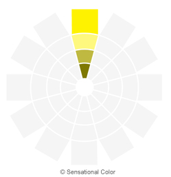
This is some many may be familiar with. Monocromatic is simply, a color scheme where all of the colors have the same hue, but have varying values and sometimes saturations.
Analogous
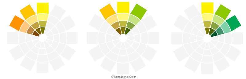
This is one many may recognize as a color scheme that has colors in the same family, or, same area of the color wheel. Combinations like blue, green, and yellow, or combinations like red, yellow, and orange.
Complimentary
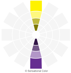
This is one where colors on opposite sides of the color wheel are picked. For example, yellow and purple, red and green, or blue and orange.
Split Complimentary
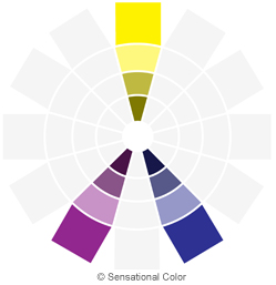
This one is similar to complimentary, but instead of picking two complimentary colors, you pick one and then the two colors on either side of its complimentary. For example, yellow and purple are complimentary colors. So say you pick yellow. You then would pick two colors on either side of it's complimentary color, purple. These two colors are blue and red. So your split complimentary harmony would be yellow, blue, and red. In the example below, they've used a more complex wheel, which has a red-purple (a purple with more red than blue in it) as one of the split complimentary colors.
Easy Palette Creator
Still a bit intimidated? No worries! You can use this handy dandy palette creator by Adobe to help you pick out good palettes. Just set your color harmony, and it will adjust the sliders accordingly. Or, feel free to set it to custom and make your own palette without following harmony rules. The best way to learn is to explore.
Hope this helped!
The Basics
The three parts to describing colors are hue, saturation, and value.
Hue - the actual color (i.e. red, blue, green, etc.)
Spoiler

Saturation - how vibrant the colors are (dull/pastel or bright), or, how much grey is in a color

Value - how light/dark the colors are, or, how much white is in a color
Spoiler

Cool & Warm Colors
A lot of people know that there are cool and warm colors. Things like blue and purple tend to be in the cool category, while red and orange are in the warm category. However, not everyone realizes that there are cool and warm versions of each color. There can be cooler oranges, and warmer purples, even cool and warm blacks. Consider these cools and warms to be a form of undertone. Anything that looks like it has more blue/green in it tends to be cooler. Anything that looks like it has more red/yellow in it tends to be warmer.
Consider the image below:

Can you see that the left is warmer than the right, in spite of both of these being grey? That is because of the undertones. Generally, picking colors that have similar undertones, and are either all warmer or all cooler can make for better color cohesion.
Color Harmonies
There are 8 typical color harmonies which are useful to know when picking colors. You can find all of them listed here, but I will cover the more popular ones in this thread - monochromatic, analogous, complimentary, and split complimentary.
Monocromatic
This is some many may be familiar with. Monocromatic is simply, a color scheme where all of the colors have the same hue, but have varying values and sometimes saturations.
Spoiler
Analogous
This is one many may recognize as a color scheme that has colors in the same family, or, same area of the color wheel. Combinations like blue, green, and yellow, or combinations like red, yellow, and orange.
Spoiler
Complimentary
This is one where colors on opposite sides of the color wheel are picked. For example, yellow and purple, red and green, or blue and orange.
Spoiler
Split Complimentary
This one is similar to complimentary, but instead of picking two complimentary colors, you pick one and then the two colors on either side of its complimentary. For example, yellow and purple are complimentary colors. So say you pick yellow. You then would pick two colors on either side of it's complimentary color, purple. These two colors are blue and red. So your split complimentary harmony would be yellow, blue, and red. In the example below, they've used a more complex wheel, which has a red-purple (a purple with more red than blue in it) as one of the split complimentary colors.
Spoiler
Easy Palette Creator
Still a bit intimidated? No worries! You can use this handy dandy palette creator by Adobe to help you pick out good palettes. Just set your color harmony, and it will adjust the sliders accordingly. Or, feel free to set it to custom and make your own palette without following harmony rules. The best way to learn is to explore.
Hope this helped!